The Art of Sleep: Choosing the Right Paint Color for Your Bedroom
LifestyleThe colors in your bedroom can significantly influence your mood, energy levels, and ability to fall asleep. This article explores the science of color psychology and offers practical guidance on choosing paint colors that promote restful sleep.
The colors we paint our bedroom can have a substantial impact on our mood, our energy levels, and in particular our ability to fall asleep. This article explores the science and art of how to choose paint colors for the bedroom that encourage sleep.
Color Psychology: What You Need To Know
Color psychology refers to how different colors change the behavior and emotions in human beings. Every color produces a different reaction, from calm and peaceful to bright and vibrant. In bedrooms, we need calm and peace that helps us sleep. That’s where soft, muted colors come in. Soft colors can make us calm and more likely to fall asleep quickly. Even the different color of your bedroom can result in different sleeping quality.
3 Cool Colors for Calming Spaces
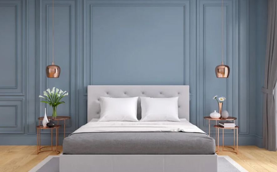
Colors like blue, green, and purple are generally considered to be best for bedrooms that strive to improve sleep quality. These are referred to as cool colors. Nature-inspired, they are frequently tied to calmness and peace.
- Bluish Colors: Powdery blue or oceanic hues can trigger a sense of calmness. They’re known to slow heart rates and lower blood pressure, making them perfect for a restful environment. Light blues are especially easy on the eyes and can impart a soothing atmosphere.
- Greens: Greens, particularly sage or mint, are representative of nature and tranquility. They lower blood pressure and reduce stress. Green, with its calming effect, can help you unwind after a long day.
- Purples: Bolder purples can signal luxury and creativity, while softer lilacs provide a good color to promote sleep. Lavender has been shown in aromatherapy science to reduce anxiety and increase sleep quality, and its color variant can have a comparably soothing effect.
Neutral Tones for Versatility & Tranquility
Beige, taupe, and gray are also great options for bedrooms. They provide a blank canvas that can be accessorized with splashes of color while still feeling serene. Neutrals are less stimulating to the brain, a likely perk for insomniacs. These earthy notes infuse a space with warmth and a welcoming feel without becoming overly saturated. They filter in natural light softly, creating a gentle, easy-to-wake environment.
Lighter hues of gray can evoke a sleek, minimalist look while maintaining a tranquil atmosphere. Gray complements wood tones and metallic accents, providing depth without reinvigorating brightness.
Personal Preference Considerations
Some colors may instill calm universally, but individuals often have different preferences. What works for one person may not do the same for another. Think about your favorite colors, past experiences with color, and how different hues make you feel. If a specific color inspires joyful memories or simply makes you feel happy, it is likely to have a positive impact on your bedtime routine.
In summary, to maximize your sleep potential, choose bedroom paint colors with cool tones and neutrals. Try samples on your walls at different times of the day to understand how natural light influences both appearance and mood. Layering textures, patterns, and lighting also helps create a cozy atmosphere. The objective is to make the space feel safe, comfortable, and inviting—a true nest for restful sleep. With the right color palette, your bedroom can become the ultimate retreat for rejuvenation and recovery.